从今天起,请跟随我一起开启20天的精益六西格玛python数字化应用开发。每天一个python程序,了解精益六西格玛黑带日常工作所用的分析工具如何通过python实现。
以下是20天的内容预告:
1.精益六西格玛黑带会用Python——流程改进的数字化应用
2.精益六西格玛Python数字化应用开发-Day1 sixsigmaspc 统计过程控制库
3.精益六西格玛Python数字化应用开发-Day2 PySpc – 简化的统计过程控制库
4.精益六西格玛Python数字化应用开发-Day3 asaliX – 精益六西格玛数学工具包
5.精益六西格玛Python数字化应用开发-Day4 pyshewhart – 休哈特控制图库
6.精益六西格玛Python数字化应用开发-Day5 通用数据分析库pandas 和 numpy
7.精益六西格玛Python数字化应用开发-Day6 scipy.stats – 统计分析核心
8.精益六西格玛Python数字化应用开发-Day7 statsmodels – 统计建模和回归分析
9. 精益六西格玛Python数字化应用开发-Day8 看板相关库kanban-python、kanbanpy
10. 精益六西格玛Python数字化应用开发-Day9 流程挖掘库PM4Py
11. 可视化库(matplotlib、seaborn、plotly 等)(本文)
12. DMAIC 方法论的 Python 实现
13. 看板方法的 Python 实现
14.应用场景:汽车零部件企业质量控制
15.应用场景:家电企业生产效率优化
16.应用场景:银行贷款审批流程优化
17.应用场景:软件开发流程的精益六西格玛优化
精益六西格玛作为一种以数据驱动为核心的质量管理方法论,其核心理念是 DMAIC 流程,覆盖问题定义到持续改进的全生命周期。传统上,精益六西格玛项目主要依赖 Minitab、JMP 等专业统计软件,但随着 Python 在数据科学领域的快速发展,越来越多的精益六西格玛黑带开始采用 Python 作为分析工具。
Python 在精益六西格玛领域的优势主要体现在其强大的数据处理能力、丰富的库生态和灵活的编程范式。与传统软件相比,Python 支持百万级数据高效处理,可实现全流程自动化和脚本化,支持机器学习、统计建模等高级算法,并能与数据库、MES/ERP 等系统无缝集成。这种开放性和强扩展性使得Python 成为精益六西格玛黑带进行复杂数据分析和流程优化的理想工具。
本文将重点介绍专门针对精益六西格玛黑带使用场景的 Python 库,这些库功能侧重于数据分析和流程优化,特别适用于 DMAIC 方法论和看板管理。考虑到读者具备中高级Python 使用经验,我们将深入探讨各库的高级功能和实际应用应用场景。
数据可视化是精益六西格玛中传达分析结果的重要手段。Python 拥有丰富的可视化库,其中:
matplotlib:基础绘图库,提供高度定制化的图表seaborn:基于 matplotlib 的高级接口,提供美观的统计图表plotly:交互式可视化库,支持动态图表和仪表板
这些库在精益六西格玛中的应用包括:
控制图的绘制和实时更新过程能力分析的可视化价值流映射的流程图绘制统计分析结果的展示
# 导入可视化库
import matplotlib.pyplot as plt
import seaborn as sns
import plotly.graph_objects as go
from plotly.subplots import make_subplots
import numpy as np
import pandas as pd
from scipy import stats
# 设置中文字体(如果需要)
plt.rcParams['font.sans-serif'] = ['DejaVu Sans']
plt.rcParams['axes.unicode_minus'] = False
# 加载数据
df = pd.read_csv('production_data.csv')
# 为数据框添加缺失的列(如果不存在)
if 'MachineSpeed' not in df.columns:
df['MachineSpeed'] = np.random.uniform(50, 100, len(df))
if 'Temperature' not in df.columns:
df['Temperature'] = np.random.uniform(20, 30, len(df))
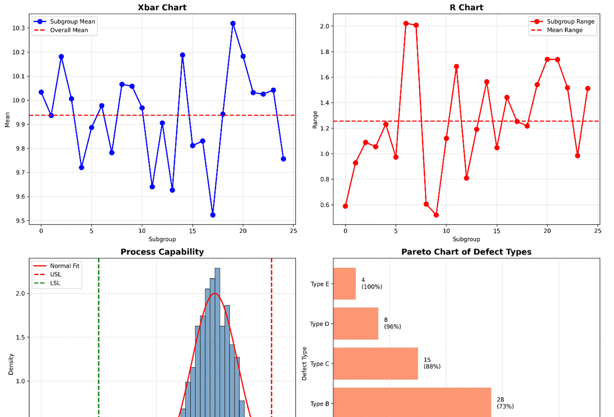
# 示例1:创建综合控制图仪表板
fig, ((ax1, ax2), (ax3, ax4)) = plt.subplots(2, 2, figsize=(15, 12))
# 1. Xbar-R控制图
data = np.random.normal(loc=10, scale=0.5, size=(25, 5))
means = np.mean(data, axis=1)
ranges = np.ptp(data, axis=1)
ax1.plot(means, 'bo-', linewidth=2, markersize=8, label='Subgroup Mean')
ax1.axhline(np.mean(means), color='r', linestyle='--', linewidth=2, label='Overall Mean')
ax1.set_title('Xbar Chart', fontsize=14, fontweight='bold')
ax1.set_xlabel('Subgroup')
ax1.set_ylabel('Mean')
ax1.grid(True, alpha=0.3)
ax1.legend()
# 2. R控制图
ax2.plot(ranges, 'ro-', linewidth=2, markersize=8, label='Subgroup Range')
ax2.axhline(np.mean(ranges), color='r', linestyle='--', linewidth=2, label='Mean Range')
ax2.set_title('R Chart', fontsize=14, fontweight='bold')
ax2.set_xlabel('Subgroup')
ax2.set_ylabel('Range')
ax2.grid(True, alpha=0.3)
ax2.legend()
# 3. 过程能力分析图
capability_data = np.random.normal(loc=10.5, scale=0.2, size=1000)
usl, lsl = 11.0, 9.5
ax3.hist(capability_data, bins=30, density=True, alpha=0.7, color='steelblue', edgecolor='black')
x = np.linspace(9, 11, 1000)
ax3.plot(x, stats.norm.pdf(x, np.mean(capability_data), np.std(capability_data)), 'r-', linewidth=2, label='Normal Fit')
ax3.axvline(usl, color='red', linestyle='--', linewidth=2, label='USL')
ax3.axvline(lsl, color='green', linestyle='--', linewidth=2, label='LSL')
ax3.set_title('Process Capability', fontsize=14, fontweight='bold')
ax3.set_xlabel('Measurement')
ax3.set_ylabel('Density')
ax3.grid(True, alpha=0.3)
ax3.legend()
# 4. 缺陷类型帕累托图
defect_types = ['Type A', 'Type B', 'Type C', 'Type D', 'Type E']
defect_counts = [45, 28, 15, 8, 4]
ax4.barh(defect_types, defect_counts, color='coral', alpha=0.8)
ax4.set_title('Pareto Chart of Defect Types', fontsize=14, fontweight='bold')
ax4.set_xlabel('Count')
ax4.set_ylabel('Defect Type')
ax4.grid(True, alpha=0.3, axis='x')
# 添加累积百分比线
cumulative = np.cumsum(defect_counts)
total = sum(defect_counts)
cumulative_pct = (cumulative / total) * 100
for i, (count, pct) in enumerate(zip(defect_counts, cumulative_pct)):
ax4.text(count + 1, i, f'{count}
({pct:.0f}%)', va='center', ha='left')
plt.tight_layout()
plt.savefig('control_chart_dashboard.png', dpi=300, bbox_inches='tight')
print("已保存图表: control_chart_dashboard.png")
plt.close()
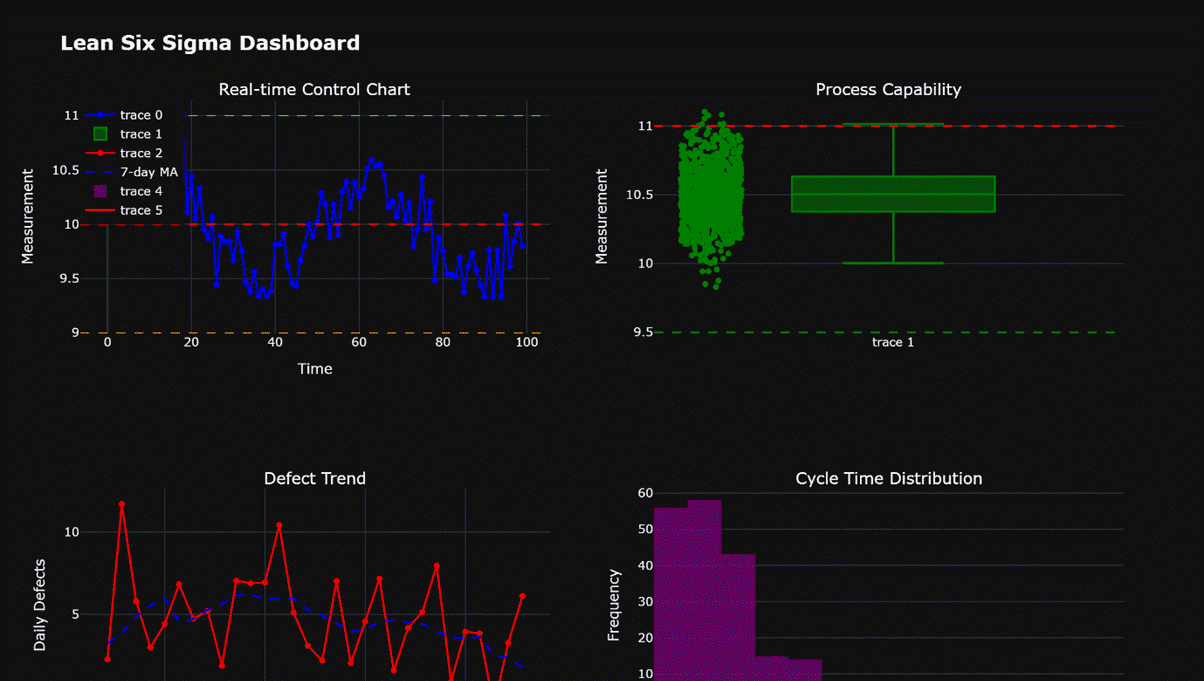
# 示例2:使用Plotly创建交互式仪表板
fig_dash = make_subplots(rows=2, cols=2,
subplot_titles=('Real-time Control Chart', 'Process Capability',
'Defect Trend', 'Cycle Time Distribution'))
# 1. 实时控制图(模拟)
time = np.arange(0, 100)
signal = 10 + 0.5 * np.sin(2 * np.pi * time / 50) + np.random.normal(0, 0.2, 100)
fig_dash.add_trace(go.Scatter(x=time, y=signal, mode='lines+markers', line=dict(color='blue', width=2)),
row=1, col=1)
fig_dash.add_hline(y=10, line=dict(color='red', dash='dash', width=2), row=1, col=1)
fig_dash.add_hline(y=11, line=dict(color='orange', dash='dash', width=1), row=1, col=1)
fig_dash.add_hline(y=9, line=dict(color='orange', dash='dash', width=1), row=1, col=1)
fig_dash.update_xaxes(title_text='Time', row=1, col=1)
fig_dash.update_yaxes(title_text='Measurement', row=1, col=1)
# 2. 过程能力瀑布图
fig_dash.add_trace(go.Box(y=capability_data, boxpoints='all', jitter=0.3, pointpos=-1.8,
marker=dict(color='green', size=6)), row=1, col=2)
fig_dash.add_hline(y=usl, line=dict(color='red', dash='dash', width=2), row=1, col=2)
fig_dash.add_hline(y=lsl, line=dict(color='green', dash='dash', width=2), row=1, col=2)
fig_dash.update_yaxes(title_text='Measurement', row=1, col=2)
# 3. 缺陷趋势图
dates = pd.date_range(start='2025-01-01', periods=30)
daily_defects = np.random.poisson(lam=5, size=30) + np.random.normal(0, 1, 30)
fig_dash.add_trace(go.Scatter(x=dates, y=daily_defects, mode='lines+markers',
line=dict(color='red', width=2)), row=2, col=1)
fig_dash.add_trace(go.Scatter(x=dates, y=np.convolve(daily_defects, np.ones(7)/7, mode='same'),
mode='lines', line=dict(color='blue', width=2, dash='dash'),
name='7-day MA'), row=2, col=1)
fig_dash.update_xaxes(title_text='Date', row=2, col=1)
fig_dash.update_yaxes(title_text='Daily Defects', row=2, col=1)
fig_dash.update_layout(legend=dict(x=0, y=1))
# 4. 周期时间分布
cycle_times = np.random.gamma(shape=2, scale=5, size=200)
fig_dash.add_trace(go.Histogram(x=cycle_times, nbinsx=30, opacity=0.7,
marker=dict(color='purple')), row=2, col=2)
fig_dash.add_trace(go.Scatter(x=np.linspace(0, 40, 1000),
y=10 * stats.gamma.pdf(np.linspace(0, 40, 1000), 2, scale=5),
mode='lines', line=dict(color='red', width=2)), row=2, col=2)
fig_dash.update_xaxes(title_text='Cycle Time (days)', row=2, col=2)
fig_dash.update_yaxes(title_text='Frequency', row=2, col=2)
fig_dash.update_layout(title='Lean Six Sigma Dashboard', title_font=dict(size=20, weight='bold'),
template='plotly_dark', width=1200, height=800)
try:
fig_dash.write_image('interactive_dashboard.png', width=1200, height=800, scale=2)
print("已保存图表: interactive_dashboard.png")
except Exception as e:
print(f"警告: 无法使用kaleido保存Plotly图表: {e}")
print("尝试使用HTML格式保存...")
fig_dash.write_html('interactive_dashboard.html')
print("已保存图表: interactive_dashboard.html (HTML格式)")
print("提示: 要保存为PNG格式,请安装kaleido: pip install kaleido")
# 示例3:使用seaborn进行高级统计可视化
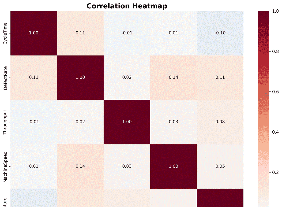
# 创建热力图展示相关性
correlation_matrix = df[['CycleTime', 'DefectRate', 'Throughput', 'MachineSpeed', 'Temperature']].corr()
plt.figure(figsize=(10, 8))
sns.heatmap(correlation_matrix, annot=True, fmt='.2f', cmap='RdBu_r', center=0)
plt.title('Correlation Heatmap', fontsize=16, fontweight='bold')
plt.tight_layout()
plt.savefig('correlation_heatmap.png', dpi=300, bbox_inches='tight')
print("已保存图表: correlation_heatmap.png")
plt.close()
# 创建成对关系图
pair_plot = sns.pairplot(df[['CycleTime', 'DefectRate', 'Throughput', 'MachineSpeed']],
diag_kind='kde', plot_kws=dict(alpha=0.6))
pair_plot.fig.suptitle('Pairwise Relationships', fontsize=16, fontweight='bold')
pair_plot.fig.tight_layout()
pair_plot.fig.savefig('pairwise_relationships.png', dpi=300, bbox_inches='tight')
print("已保存图表: pairwise_relationships.png")
plt.close()程序运行结果如下:

© 版权声明
文章版权归作者所有,未经允许请勿转载。
相关文章


暂无评论...