
1. 项目概述
本项目将通过Python编程语言,结合多个数据处理和可视化库,对城市气温数据进行全面分析和可视化展示。我们将使用真实世界的气象数据,演示从数据获取、清洗、分析到可视化的完整流程。
1.1 项目目标
收集并处理多城市历史气温数据
分析气温变化趋势和季节性模式
创建多种可视化图表展示分析结果
构建交互式数据可视化应用
1.2 技术栈
数据处理:Pandas, NumPy
数据可视化:Matplotlib, Seaborn, Plotly
地理可视化:Folium, Geopandas
交互界面:Streamlit
数据源:公开气象数据集
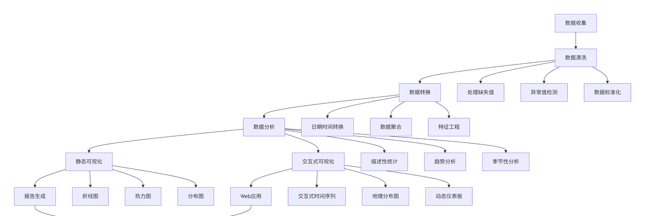
2. 数据处理流程
下面是完整的数据处理与可视化流程图:
graph TD
    A[数据收集] --> B[数据清洗]
    B --> C[数据转换]
    C --> D[数据分析]
    D --> E[静态可视化]
    D --> F[交互式可视化]
    E --> G[报告生成]
    F --> H[Web应用]
    G --> I[结果展示]
    H --> I

    B --> B1[处理缺失值]
    B --> B2[异常值检测]
    B --> B3[数据标准化]

    C --> C1[日期时间转换]
    C --> C2[数据聚合]
    C --> C3[特征工程]

    D --> D1[描述性统计]
    D --> D2[趋势分析]
    D --> D3[季节性分析]

    E --> E1[折线图]
    E --> E2[热力图]
    E --> E3[分布图]

    F --> F1[交互式时间序列]
    F --> F2[地理分布图]
    F --> F3[动态仪表板]
3. 数据收集与预处理
3.1 数据获取
我们首先创建一个模拟多个城市气温数据集的函数,模拟真实世界的气象数据:
python
import pandas as pd
import numpy as np
import matplotlib.pyplot as plt
import seaborn as sns
import plotly.express as px
import plotly.graph_objects as go
from plotly.subplots import make_subplots
import folium
from folium.plugins import HeatMap
import streamlit as st
from datetime import datetime, timedelta
import warnings
warnings.filterwarnings('ignore')

# 设置中文字体
plt.rcParams['font.sans-serif'] = ['SimHei']
plt.rcParams['axes.unicode_minus'] = False

def generate_weather_data():
    """
    生成模拟的多城市气温数据
    """
    np.random.seed(42)

    # 城市列表及其基本气候特征
    cities = {
        '北京': {'lat': 39.9, 'lon': 116.4, 'temp_range': (-10, 35)},
        '上海': {'lat': 31.2, 'lon': 121.5, 'temp_range': (0, 38)},
        '广州': {'lat': 23.1, 'lon': 113.3, 'temp_range': (10, 40)},
        '哈尔滨': {'lat': 45.8, 'lon': 126.6, 'temp_range': (-25, 30)},
        '昆明': {'lat': 25.0, 'lon': 102.7, 'temp_range': (5, 28)},
        '乌鲁木齐': {'lat': 43.8, 'lon': 87.6, 'temp_range': (-20, 35)},
        '成都': {'lat': 30.7, 'lon': 104.1, 'temp_range': (5, 35)},
        '西安': {'lat': 34.3, 'lon': 108.9, 'temp_range': (-5, 38)}
    }

    # 生成3年的每日数据
    start_date = datetime(2020, 1, 1)
    end_date = datetime(2022, 12, 31)
    date_range = pd.date_range(start=start_date, end=end_date, freq='D')

    data = []
    for city, info in cities.items():
        base_temp = (info['temp_range'][0] + info['temp_range'][1]) / 2
        temp_variation = (info['temp_range'][1] - info['temp_range'][0]) / 2

        for date in date_range:
            # 模拟季节性变化
            day_of_year = date.timetuple().tm_yday
            seasonal_factor = -np.cos(2 * np.pi * day_of_year / 365) * temp_variation

            # 添加随机波动
            random_noise = np.random.normal(0, 3)

            # 计算当日温度
            daily_temp = base_temp + seasonal_factor + random_noise

            # 添加一些缺失值(模拟真实数据)
            if np.random.random() < 0.01:  # 1%的数据缺失
                daily_temp = np.nan

            data.append({
                'city': city,
                'date': date,
                'temperature': daily_temp,
                'latitude': info['lat'],
                'longitude': info['lon']
            })

    df = pd.DataFrame(data)

    # 添加月份和季节信息
    df['month'] = df['date'].dt.month
    df['year'] = df['date'].dt.year
    df['season'] = df['month'].map({12: '冬季', 1: '冬季', 2: '冬季',
                                   3: '春季', 4: '春季', 5: '春季',
                                   6: '夏季', 7: '夏季', 8: '夏季',
                                   9: '秋季', 10: '秋季', 11: '秋季'})

    return df

# 生成数据
weather_df = generate_weather_data()
print("数据生成完成!")
print(f"数据集形状: {weather_df.shape}")
print(weather_df.head())
3.2 数据清洗与探索
接下来我们对数据进行清洗和初步探索:
python
def clean_and_explore_data(df):
    """
    数据清洗与探索性分析
    """
    print("=== 数据清洗与探索性分析 ===")

    # 1. 检查数据基本信息
    print("
1. 数据基本信息:")
    print(f"数据形状: {df.shape}")
    print(f"时间范围: {df['date'].min()} 到 {df['date'].max()}")
    print(f"城市数量: {df['city'].nunique()}")
    print(f"包含城市: {', '.join(df['city'].unique())}")

    # 2. 检查缺失值
    print("
2. 缺失值统计:")
    missing_data = df.isnull().sum()
    print(missing_data)

    # 3. 处理缺失值 - 使用前后值的平均值填充
    df_cleaned = df.copy()
    df_cleaned['temperature'] = df_cleaned.groupby('city')['temperature'].transform(
        lambda x: x.fillna(x.rolling(window=7, min_periods=1).mean())
    )

    # 如果还有缺失值,使用该城市的月平均温度填充
    monthly_avg = df_cleaned.groupby(['city', 'month'])['temperature'].transform('mean')
    df_cleaned['temperature'] = df_cleaned['temperature'].fillna(monthly_avg)

    print(f"
处理缺失值后,剩余缺失值: {df_cleaned['temperature'].isnull().sum()}")

    # 4. 检查异常值
    print("
3. 温度数据统计描述:")
    print(df_cleaned['temperature'].describe())

    # 使用箱线图法则检测异常值
    Q1 = df_cleaned['temperature'].quantile(0.25)
    Q3 = df_cleaned['temperature'].quantile(0.75)
    IQR = Q3 - Q1
    lower_bound = Q1 - 1.5 * IQR
    upper_bound = Q3 + 1.5 * IQR

    outliers = df_cleaned[(df_cleaned['temperature'] < lower_bound) |
                         (df_cleaned['temperature'] > upper_bound)]
    print(f"
检测到的异常值数量: {len(outliers)}")

    # 5. 数据分布可视化
    plt.figure(figsize=(15, 10))

    plt.subplot(2, 2, 1)
    df_cleaned['temperature'].hist(bins=50, alpha=0.7, color='skyblue')
    plt.title('温度分布直方图')
    plt.xlabel('温度(°C)')
    plt.ylabel('频次')

    plt.subplot(2, 2, 2)
    df_cleaned.boxplot(column='temperature', by='city', grid=False)
    plt.title('各城市温度箱线图')
    plt.suptitle('')  # 移除自动标题
    plt.xticks(rotation=45)

    plt.subplot(2, 2, 3)
    seasonal_avg = df_cleaned.groupby('season')['temperature'].mean()
    seasonal_avg.plot(kind='bar', color=['lightblue', 'lightgreen', 'lightcoral', 'wheat'])
    plt.title('各季节平均温度')
    plt.ylabel('平均温度(°C)')

    plt.subplot(2, 2, 4)
    yearly_avg = df_cleaned.groupby('year')['temperature'].mean()
    yearly_avg.plot(kind='line', marker='o', color='purple')
    plt.title('年度平均温度变化')
    plt.ylabel('平均温度(°C)')

    plt.tight_layout()
    plt.savefig('data_exploration.png', dpi=300, bbox_inches='tight')
    plt.show()

    return df_cleaned

# 执行数据清洗与探索
cleaned_df = clean_and_explore_data(weather_df)
4. 数据分析与可视化
4.1 气温趋势分析
python
def analyze_temperature_trends(df):
    """
    分析气温趋势
    """
    print("=== 气温趋势分析 ===")

    # 1. 计算月度平均温度
    monthly_avg = df.groupby(['year', 'month', 'city'])['temperature'].mean().reset_index()
    monthly_avg['year_month'] = monthly_avg['year'].astype(str) + '-' + monthly_avg['month'].astype(str).str.zfill(2)

    # 2. 创建趋势可视化
    fig = make_subplots(
        rows=2, cols=2,
        subplot_titles=('各城市月度温度变化', '年度温度对比',
                       '季节温度分布', '温度变化趋势'),
        specs=[[{"secondary_y": False}, {"secondary_y": False}],
               [{"secondary_y": False}, {"secondary_y": False}]]
    )

    # 各城市月度温度变化(以北京为例)
    beijing_data = monthly_avg[monthly_avg['city'] == '北京']
    fig.add_trace(
        go.Scatter(x=beijing_data['year_month'], y=beijing_data['temperature'],
                  mode='lines+markers', name='北京', line=dict(color='red')),
        row=1, col=1
    )

    # 添加其他城市(为了图表清晰,只显示部分)
    for city in ['上海', '广州', '哈尔滨']:
        city_data = monthly_avg[monthly_avg['city'] == city]
        fig.add_trace(
            go.Scatter(x=city_data['year_month'], y=city_data['temperature'],
                      mode='lines', name=city),
            row=1, col=1
        )

    # 年度温度对比
    yearly_avg = df.groupby(['year', 'city'])['temperature'].mean().reset_index()
    for city in df['city'].unique():
        city_year_data = yearly_avg[yearly_avg['city'] == city]
        fig.add_trace(
            go.Bar(x=city_year_data['year'], y=city_year_data['temperature'],
                  name=city, showlegend=False),
            row=1, col=2
        )

    # 季节温度分布
    seasonal_data = df.groupby(['season', 'city'])['temperature'].mean().reset_index()
    seasons = ['春季', '夏季', '秋季', '冬季']

    for i, season in enumerate(seasons):
        season_city_data = seasonal_data[seasonal_data['season'] == season]
        fig.add_trace(
            go.Box(y=season_city_data['temperature'], name=season,
                  marker_color=['lightblue', 'lightgreen', 'lightcoral', 'wheat'][i]),
            row=2, col=1
        )

    # 温度变化趋势(线性回归)
    from sklearn.linear_model import LinearRegression

    trend_data = []
    for city in df['city'].unique():
        city_data = df[df['city'] == city].copy()
        city_data['day_num'] = (city_data['date'] - city_data['date'].min()).dt.days

        X = city_data[['day_num']]
        y = city_data['temperature']

        model = LinearRegression()
        model.fit(X, y)
        trend = model.coef_[0] * 365  # 年变化率

        trend_data.append({
            'city': city,
            'trend': trend,
            'lat': city_data['latitude'].iloc[0],
            'lon': city_data['longitude'].iloc[0]
        })

    trend_df = pd.DataFrame(trend_data)

    fig.add_trace(
        go.Bar(x=trend_df['city'], y=trend_df['trend'],
              marker_color=['red' if x > 0 else 'blue' for x in trend_df['trend']]),
        row=2, col=2
    )

    fig.update_layout(height=800, title_text="气温趋势综合分析", showlegend=True)
    fig.write_html('temperature_trends.html')
    fig.show()

    return trend_df

# 执行趋势分析
trend_analysis = analyze_temperature_trends(cleaned_df)
4.2 气温地理分布可视化
python
def create_geographical_visualizations(df, trend_df):
    """
    创建地理分布可视化
    """
    print("=== 创建地理分布可视化 ===")

    # 1. 创建基础地图
    center_lat = df['latitude'].mean()
    center_lon = df['longitude'].mean()

    # 平均温度地图
    avg_temp_by_city = df.groupby('city').agg({
        'temperature': 'mean',
        'latitude': 'first',
        'longitude': 'first'
    }).reset_index()

    m = folium.Map(location=[center_lat, center_lon], zoom_start=4)

    # 添加温度圆圈标记
    for idx, row in avg_temp_by_city.iterrows():
        # 根据温度设置颜色
        temp = row['temperature']
        if temp < 10:
            color = 'blue'
        elif temp < 20:
            color = 'green'
        elif temp < 25:
            color = 'orange'
        else:
            color = 'red'

        # 添加圆形标记
        folium.CircleMarker(
            location=[row['latitude'], row['longitude']],
            radius=15,
            popup=f"{row['city']}<br>平均温度: {temp:.1f}°C",
            tooltip=row['city'],
            color=color,
            fillColor=color,
            fillOpacity=0.6
        ).add_to(m)

    # 保存地图
    m.save('temperature_map.html')

    # 2. 使用Plotly创建交互式地理散点图
    fig = px.scatter_mapbox(avg_temp_by_city,
                           lat="latitude",
                           lon="longitude",
                           hover_name="city",
                           hover_data={"temperature": ":.1f"},
                           color="temperature",
                           size_max=15,
                           zoom=3,
                           mapbox_style="open-street-map",
                           title="各城市平均温度分布",
                           color_continuous_scale=px.colors.sequential.Viridis)

    fig.write_html('interactive_temperature_map.html')
    fig.show()

    # 3. 创建温度变化趋势地图
    fig_trend = px.scatter_mapbox(trend_df,
                                lat="lat",
                                lon="lon",
                                hover_name="city",
                                hover_data={"trend": ":.3f"},
                                color="trend",
                                color_continuous_scale=px.colors.diverging.RdBu_r,
                                size_max=15,
                                zoom=3,
                                mapbox_style="open-street-map",
                                title="各城市年温度变化趋势(°C/年)")

    fig_trend.write_html('temperature_trend_map.html')
    fig_trend.show()

    # 4. 创建热力图(需要更多数据点)
    # 为演示目的,我们生成更密集的模拟数据
    heatmap_data = []
    for city, info in avg_temp_by_city.iterrows():
        for _ in range(50):  # 为每个城市生成多个数据点
            lat_noise = np.random.normal(0, 0.5)
            lon_noise = np.random.normal(0, 0.5)
            temp_noise = np.random.normal(0, 2)

            heatmap_data.append([
                info['latitude'] + lat_noise,
                info['longitude'] + lon_noise,
                info['temperature'] + temp_noise
            ])

    heatmap_df = pd.DataFrame(heatmap_data, columns=['lat', 'lon', 'temperature'])

    heatmap_fig = px.density_mapbox(heatmap_df,
                                   lat='lat',
                                   lon='lon',
                                   z='temperature',
                                   radius=10,
                                   center=dict(lat=center_lat, lon=center_lon),
                                   zoom=3,
                                   mapbox_style="open-street-map",
                                   title="温度分布热力图",
                                   color_continuous_scale=px.colors.sequential.Jet)

    heatmap_fig.write_html('temperature_heatmap.html')
    heatmap_fig.show()

# 创建地理可视化
create_geographical_visualizations(cleaned_df, trend_analysis)
4.3 高级时间序列分析
python
def advanced_time_series_analysis(df):
    """
    高级时间序列分析
    """
    print("=== 高级时间序列分析 ===")

    # 1. 准备数据 - 以北京为例
    beijing_df = df[df['city'] == '北京'].copy()
    beijing_df = beijing_df.set_index('date')
    daily_temp = beijing_df['temperature']

    # 2. 移动平均平滑
    daily_temp_7d = daily_temp.rolling(window=7).mean()
    daily_temp_30d = daily_temp.rolling(window=30).mean()

    # 3. 季节性分解
    from statsmodels.tsa.seasonal import seasonal_decompose

    # 使用月度数据进行分析
    monthly_data = df[df['city'] == '北京'].groupby(pd.Grouper(key='date', freq='M'))['temperature'].mean()

    # 季节性分解
    decomposition = seasonal_decompose(monthly_data, model='additive', period=12)

    # 4. 创建综合时间序列分析图
    fig = make_subplots(
        rows=3, cols=2,
        subplot_titles=('北京每日温度与移动平均', '温度分布箱线图',
                       '季节性分解 - 趋势', '季节性分解 - 季节性',
                       '年度温度对比', '残差分析'),
        specs=[[{"colspan": 2}, None],
               [{}, {}],
               [{}, {}]]
    )

    # 子图1: 每日温度与移动平均
    fig.add_trace(
        go.Scatter(x=daily_temp.index, y=daily_temp,
                  mode='lines', name='每日温度', line=dict(color='lightgray', width=1)),
        row=1, col=1
    )
    fig.add_trace(
        go.Scatter(x=daily_temp_7d.index, y=daily_temp_7d,
                  mode='lines', name='7日移动平均', line=dict(color='blue', width=2)),
        row=1, col=1
    )
    fig.add_trace(
        go.Scatter(x=daily_temp_30d.index, y=daily_temp_30d,
                  mode='lines', name='30日移动平均', line=dict(color='red', width=2)),
        row=1, col=1
    )

    # 子图2: 月度温度分布箱线图
    monthly_box = []
    months = range(1, 13)
    month_names = ['1月', '2月', '3月', '4月', '5月', '6月',
                  '7月', '8月', '9月', '10月', '11月', '12月']

    for month in months:
        monthly_data = beijing_df[beijing_df.index.month == month]['temperature']
        fig.add_trace(
            go.Box(y=monthly_data, name=month_names[month-1], showlegend=False),
            row=1, col=2
        )

    # 子图3: 趋势成分
    fig.add_trace(
        go.Scatter(x=decomposition.trend.index, y=decomposition.trend,
                  mode='lines', name='趋势', line=dict(color='green')),
        row=2, col=1
    )

    # 子图4: 季节性成分
    fig.add_trace(
        go.Scatter(x=decomposition.seasonal.index, y=decomposition.seasonal,
                  mode='lines', name='季节性', line=dict(color='orange')),
        row=2, col=2
    )

    # 子图5: 年度温度对比
    years = df['year'].unique()
    for year in years:
        year_data = beijing_df[beijing_df.index.year == year]
        daily_avg = year_data.groupby(year_data.index.dayofyear)['temperature'].mean()
        fig.add_trace(
            go.Scatter(x=daily_avg.index, y=daily_avg,
                      mode='lines', name=str(year)),
            row=3, col=1
        )

    # 子图6: 残差
    fig.add_trace(
        go.Scatter(x=decomposition.resid.index, y=decomposition.resid,
                  mode='markers', name='残差', marker=dict(color='purple', size=4)),
        row=3, col=2
    )

    fig.update_layout(height=1200, title_text="北京气温时间序列深度分析", showlegend=True)
    fig.write_html('time_series_analysis.html')
    fig.show()

    # 5. 温度极端事件分析
    print("
温度极端事件分析:")

    # 计算各月的温度阈值(用于定义极端温度)
    monthly_thresholds = beijing_df.groupby(beijing_df.index.month)['temperature'].agg([
        ('Q1', lambda x: x.quantile(0.05)),  # 极端低温阈值(5%分位数)
        ('Q3', lambda x: x.quantile(0.95))   # 极端高温阈值(95%分位数)
    ]).reset_index()

    # 识别极端温度日
    extreme_days = []
    for idx, row in beijing_df.iterrows():
        month = idx.month
        threshold = monthly_thresholds[monthly_thresholds['index'] == month]

        if row['temperature'] < threshold['Q1'].values[0]:
            extreme_days.append({'date': idx, 'temperature': row['temperature'],
                               'type': '极端低温', 'deviation': row['temperature'] - threshold['Q1'].values[0]})
        elif row['temperature'] > threshold['Q3'].values[0]:
            extreme_days.append({'date': idx, 'temperature': row['temperature'],
                               'type': '极端高温', 'deviation': row['temperature'] - threshold['Q3'].values[0]})

    extreme_df = pd.DataFrame(extreme_days)

    if not extreme_df.empty:
        print(f"检测到极端温度天数: {len(extreme_df)}")
        print(f"极端高温天数: {len(extreme_df[extreme_df['type'] == '极端高温'])}")
        print(f"极端低温天数: {len(extreme_df[extreme_df['type'] == '极端低温'])}")

        # 极端事件可视化
        plt.figure(figsize=(12, 6))

        # 绘制温度时间序列并标记极端事件
        plt.plot(beijing_df.index, beijing_df['temperature'],
                alpha=0.5, color='gray', label='每日温度')

        hot_events = extreme_df[extreme_df['type'] == '极端高温']
        cold_events = extreme_df[extreme_df['type'] == '极端低温']

        plt.scatter(hot_events['date'], hot_events['temperature'],
                   color='red', s=30, label='极端高温', alpha=0.7)
        plt.scatter(cold_events['date'], cold_events['temperature'],
                   color='blue', s=30, label='极端低温', alpha=0.7)

        plt.title('北京极端温度事件检测')
        plt.ylabel('温度(°C)')
        plt.legend()
        plt.grid(True, alpha=0.3)
        plt.tight_layout()
        plt.savefig('extreme_events.png', dpi=300, bbox_inches='tight')
        plt.show()

    return extreme_df

# 执行高级时间序列分析
extreme_events = advanced_time_series_analysis(cleaned_df)
5. 交互式数据可视化应用
5.1 创建Streamlit交互式应用
python
def create_interactive_dashboard(df):
    """
    创建交互式仪表板
    """
    import streamlit as st
    import plotly.express as px
    import plotly.graph_objects as go

    st.set_page_config(
        page_title="城市气温分析仪表板",
        page_icon="🌡️",
        layout="wide",
        initial_sidebar_state="expanded"
    )

    st.title("🌡️ 中国主要城市气温数据分析仪表板")
    st.markdown("---")

    # 侧边栏控件
    st.sidebar.header("数据筛选选项")

    # 城市选择
    available_cities = df['city'].unique()
    selected_cities = st.sidebar.multiselect(
        "选择城市",
        options=available_cities,
        default=['北京', '上海', '广州']
    )

    # 时间范围选择
    min_date = df['date'].min()
    max_date = df['date'].max()

    date_range = st.sidebar.date_input(
        "选择时间范围",
        value=(min_date, max_date),
        min_value=min_date,
        max_value=max_date
    )

    # 数据聚合级别
    aggregation = st.sidebar.selectbox(
        "数据聚合级别",
        options=["每日", "每周", "月度", "年度"]
    )

    # 根据选择过滤数据
    filtered_df = df[df['city'].isin(selected_cities)]

    if len(date_range) == 2:
        start_date, end_date = date_range
        filtered_df = filtered_df[
            (filtered_df['date'] >= pd.Timestamp(start_date)) &
            (filtered_df['date'] <= pd.Timestamp(end_date))
        ]

    # 根据聚合级别重新采样数据
    if aggregation == "每周":
        agg_df = filtered_df.groupby(['city', pd.Grouper(key='date', freq='W')])['temperature'].mean().reset_index()
    elif aggregation == "月度":
        agg_df = filtered_df.groupby(['city', pd.Grouper(key='date', freq='M')])['temperature'].mean().reset_index()
    elif aggregation == "年度":
        agg_df = filtered_df.groupby(['city', pd.Grouper(key='date', freq='Y')])['temperature'].mean().reset_index()
    else:
        agg_df = filtered_df

    # 主仪表板布局
    col1, col2 = st.columns([2, 1])

    with col1:
        st.subheader("温度时间序列")

        if not agg_df.empty:
            fig = px.line(agg_df, x='date', y='temperature', color='city',
                         title=f"各城市温度变化趋势 ({aggregation})",
                         labels={'temperature': '温度 (°C)', 'date': '日期'})

            fig.update_layout(
                hovermode='x unified',
                xaxis=dict(rangeslider=dict(visible=True))
            )

            st.plotly_chart(fig, use_container_width=True)
        else:
            st.warning("请选择至少一个城市")

    with col2:
        st.subheader("数据统计")

        if not filtered_df.empty:
            # 计算基本统计量
            stats_data = []
            for city in selected_cities:
                city_data = filtered_df[filtered_df['city'] == city]['temperature']
                stats_data.append({
                    '城市': city,
                    '平均温度': f"{city_data.mean():.1f}°C",
                    '最高温度': f"{city_data.max():.1f}°C",
                    '最低温度': f"{city_data.min():.1f}°C",
                    '温度标准差': f"{city_data.std():.1f}°C"
                })

            stats_df = pd.DataFrame(stats_data)
            st.dataframe(stats_df, use_container_width=True)

            # 季节性平均温度
            st.subheader("季节性分析")
            seasonal_avg = filtered_df.groupby(['city', 'season'])['temperature'].mean().reset_index()

            fig_season = px.box(seasonal_avg, x='season', y='temperature', color='city',
                               title="各城市季节性温度分布")
            st.plotly_chart(fig_season, use_container_width=True)

    # 第二行:地理分布和热力图
    col3, col4 = st.columns(2)

    with col3:
        st.subheader("地理分布")

        # 计算各城市平均温度
        city_avg = filtered_df.groupby('city').agg({
            'temperature': 'mean',
            'latitude': 'first',
            'longitude': 'first'
        }).reset_index()

        if not city_avg.empty:
            fig_map = px.scatter_mapbox(city_avg,
                                       lat="latitude",
                                       lon="longitude",
                                       hover_name="city",
                                       hover_data={"temperature": ":.1f"},
                                       color="temperature",
                                       size_max=15,
                                       zoom=3,
                                       mapbox_style="open-street-map",
                                       title="城市平均温度分布")

            st.plotly_chart(fig_map, use_container_width=True)

    with col4:
        st.subheader("温度分布直方图")

        if not filtered_df.empty:
            fig_hist = px.histogram(filtered_df, x='temperature', color='city',
                                   marginal="box", nbins=50,
                                   title="温度分布直方图",
                                   labels={'temperature': '温度 (°C)'})

            st.plotly_chart(fig_hist, use_container_width=True)

    # 第三行:高级分析
    st.subheader("高级分析")

    col5, col6 = st.columns(2)

    with col5:
        # 月度温度热力图
        st.markdown("##### 月度温度热力图")

        if not filtered_df.empty:
            # 创建数据透视表
            monthly_pivot = filtered_df.pivot_table(
                values='temperature',
                index='city',
                columns='month',
                aggfunc='mean'
            )

            fig_heatmap = px.imshow(monthly_pivot,
                                   aspect="auto",
                                   title="各城市月度平均温度热力图",
                                   color_continuous_scale="Viridis",
                                   labels=dict(x="月份", y="城市", color="温度 (°C)"))

            st.plotly_chart(fig_heatmap, use_container_width=True)

    with col6:
        # 年度对比
        st.markdown("##### 年度温度对比")

        if not filtered_df.empty:
            yearly_avg = filtered_df.groupby(['city', 'year'])['temperature'].mean().reset_index()

            fig_year = px.line(yearly_avg, x='year', y='temperature', color='city',
                              markers=True, title="年度平均温度变化")

            st.plotly_chart(fig_year, use_container_width=True)

    # 数据下载
    st.sidebar.markdown("---")
    st.sidebar.subheader("数据导出")

    if st.sidebar.button("导出筛选数据为CSV"):
        csv = filtered_df.to_csv(index=False)
        st.sidebar.download_button(
            label="下载CSV文件",
            data=csv,
            file_name=f"temperature_data_{datetime.now().strftime('%Y%m%d_%H%M%S')}.csv",
            mime="text/csv"
        )

# 注意:Streamlit应用需要单独运行
# 保存为单独的文件并运行: streamlit run app.py
5.2 创建完整的Streamlit应用文件
将以下代码保存为
temperature_dashboard.py
streamlit run temperature_dashboard.py
python
# temperature_dashboard.py
import streamlit as st
import pandas as pd
import numpy as np
import plotly.express as px
import plotly.graph_objects as go
from datetime import datetime
import warnings
warnings.filterwarnings('ignore')

# 设置页面
st.set_page_config(
    page_title="城市气温分析仪表板",
    page_icon="🌡️",
    layout="wide",
    initial_sidebar_state="expanded"
)

# 标题
st.title("🌡️ 中国主要城市气温数据分析仪表板")
st.markdown("""
本仪表板展示中国主要城市的历史气温数据,提供多种可视化方式分析温度趋势、分布和模式。
""")
st.markdown("---")

# 生成示例数据(在实际应用中,这里应该从文件或数据库加载数据)
@st.cache_data
def load_data():
    """生成示例气温数据"""
    np.random.seed(42)

    cities = {
        '北京': {'lat': 39.9, 'lon': 116.4, 'temp_range': (-10, 35)},
        '上海': {'lat': 31.2, 'lon': 121.5, 'temp_range': (0, 38)},
        '广州': {'lat': 23.1, 'lon': 113.3, 'temp_range': (10, 40)},
        '哈尔滨': {'lat': 45.8, 'lon': 126.6, 'temp_range': (-25, 30)},
        '昆明': {'lat': 25.0, 'lon': 102.7, 'temp_range': (5, 28)},
        '成都': {'lat': 30.7, 'lon': 104.1, 'temp_range': (5, 35)},
    }

    date_range = pd.date_range(start='2020-01-01', end='2022-12-31', freq='D')

    data = []
    for city, info in cities.items():
        base_temp = (info['temp_range'][0] + info['temp_range'][1]) / 2
        temp_variation = (info['temp_range'][1] - info['temp_range'][0]) / 2

        for date in date_range:
            day_of_year = date.timetuple().tm_yday
            seasonal_factor = -np.cos(2 * np.pi * day_of_year / 365) * temp_variation
            random_noise = np.random.normal(0, 3)

            daily_temp = base_temp + seasonal_factor + random_noise

            data.append({
                'city': city,
                'date': date,
                'temperature': daily_temp,
                'latitude': info['lat'],
                'longitude': info['lon']
            })

    df = pd.DataFrame(data)
    df['month'] = df['date'].dt.month
    df['year'] = df['date'].dt.year
    df['season'] = df['month'].map({12: '冬季', 1: '冬季', 2: '冬季',
                                   3: '春季', 4: '春季', 5: '春季',
                                   6: '夏季', 7: '夏季', 8: '夏季',
                                   9: '秋季', 10: '秋季', 11: '秋季'})
    return df

# 加载数据
df = load_data()

# 侧边栏
st.sidebar.header("🔧 数据筛选选项")

# 城市选择
available_cities = df['city'].unique()
selected_cities = st.sidebar.multiselect(
    "选择城市",
    options=available_cities,
    default=['北京', '上海', '广州']
)

# 时间范围选择
min_date = df['date'].min().date()
max_date = df['date'].max().date()

date_range = st.sidebar.date_input(
    "选择时间范围",
    value=(min_date, max_date),
    min_value=min_date,
    max_value=max_date
)

# 数据聚合级别
aggregation = st.sidebar.selectbox(
    "数据聚合级别",
    options=["每日", "每周", "月度", "年度"]
)

# 根据选择过滤数据
filtered_df = df[df['city'].isin(selected_cities)]

if len(date_range) == 2:
    start_date, end_date = date_range
    filtered_df = filtered_df[
        (filtered_df['date'] >= pd.Timestamp(start_date)) &
        (filtered_df['date'] <= pd.Timestamp(end_date))
    ]

# 根据聚合级别重新采样数据
if aggregation == "每周":
    agg_df = filtered_df.groupby(['city', pd.Grouper(key='date', freq='W')])['temperature'].mean().reset_index()
    agg_df['date'] = agg_df['date'] - pd.Timedelta(days=6)  # 调整到周开始
elif aggregation == "月度":
    agg_df = filtered_df.groupby(['city', pd.Grouper(key='date', freq='M')])['temperature'].mean().reset_index()
elif aggregation == "年度":
    agg_df = filtered_df.groupby(['city', pd.Grouper(key='date', freq='Y')])['temperature'].mean().reset_index()
else:
    agg_df = filtered_df

# 主仪表板
if not selected_cities:
    st.warning("⚠️ 请至少选择一个城市")
else:
    # 第一行:关键指标
    st.subheader("📊 关键指标")

    col1, col2, col3, col4 = st.columns(4)

    with col1:
        avg_temp = filtered_df['temperature'].mean()
        st.metric("平均温度", f"{avg_temp:.1f}°C")

    with col2:
        max_temp = filtered_df['temperature'].max()
        st.metric("最高温度", f"{max_temp:.1f}°C")

    with col3:
        min_temp = filtered_df['temperature'].min()
        st.metric("最低温度", f"{min_temp:.1f}°C")

    with col4:
        temp_std = filtered_df['temperature'].std()
        st.metric("温度标准差", f"{temp_std:.1f}°C")

    # 第二行:时间序列和统计
    col1, col2 = st.columns([2, 1])

    with col1:
        st.subheader("📈 温度时间序列")

        fig = px.line(agg_df, x='date', y='temperature', color='city',
                     title=f"各城市温度变化趋势 ({aggregation})",
                     labels={'temperature': '温度 (°C)', 'date': '日期'})

        fig.update_layout(
            hovermode='x unified',
            xaxis=dict(rangeslider=dict(visible=True))
        )

        st.plotly_chart(fig, use_container_width=True)

    with col2:
        st.subheader("📋 数据统计")

        # 计算基本统计量
        stats_data = []
        for city in selected_cities:
            city_data = filtered_df[filtered_df['city'] == city]['temperature']
            stats_data.append({
                '城市': city,
                '平均温度': f"{city_data.mean():.1f}°C",
                '最高温度': f"{city_data.max():.1f}°C",
                '最低温度': f"{city_data.min():.1f}°C",
                '温度标准差': f"{city_data.std():.1f}°C"
            })

        stats_df = pd.DataFrame(stats_data)
        st.dataframe(stats_df, use_container_width=True)

    # 第三行:地理分布和直方图
    col3, col4 = st.columns(2)

    with col3:
        st.subheader("🗺️ 地理分布")

        # 计算各城市平均温度
        city_avg = filtered_df.groupby('city').agg({
            'temperature': 'mean',
            'latitude': 'first',
            'longitude': 'first'
        }).reset_index()

        fig_map = px.scatter_mapbox(city_avg,
                                   lat="latitude",
                                   lon="longitude",
                                   hover_name="city",
                                   hover_data={"temperature": ":.1f"},
                                   color="temperature",
                                   size_max=15,
                                   zoom=3,
                                   mapbox_style="open-street-map",
                                   title="城市平均温度分布")

        st.plotly_chart(fig_map, use_container_width=True)

    with col4:
        st.subheader("📊 温度分布")

        fig_hist = px.histogram(filtered_df, x='temperature', color='city',
                               marginal="box", nbins=50,
                               title="温度分布直方图",
                               labels={'temperature': '温度 (°C)'})

        st.plotly_chart(fig_hist, use_container_width=True)

    # 第四行:季节性分析和热力图
    st.subheader("🎯 深度分析")

    col5, col6 = st.columns(2)

    with col5:
        st.markdown("##### 季节性分析")

        seasonal_avg = filtered_df.groupby(['city', 'season'])['temperature'].mean().reset_index()

        fig_season = px.box(seasonal_avg, x='season', y='temperature', color='city',
                           title="各城市季节性温度分布")
        st.plotly_chart(fig_season, use_container_width=True)

    with col6:
        st.markdown("##### 月度温度热力图")

        # 创建数据透视表
        monthly_pivot = filtered_df.pivot_table(
            values='temperature',
            index='city',
            columns='month',
            aggfunc='mean'
        )

        # 重命名月份列
        month_names = ['1月', '2月', '3月', '4月', '5月', '6月',
                      '7月', '8月', '9月', '10月', '11月', '12月']
        monthly_pivot.columns = month_names[:len(monthly_pivot.columns)]

        fig_heatmap = px.imshow(monthly_pivot,
                               aspect="auto",
                               title="各城市月度平均温度热力图",
                               color_continuous_scale="Viridis",
                               labels=dict(x="月份", y="城市", color="温度 (°C)"))

        st.plotly_chart(fig_heatmap, use_container_width=True)

# 侧边栏底部
st.sidebar.markdown("---")
st.sidebar.markdown("### 关于")
st.sidebar.info(
    """
    这是一个演示性的气温数据分析仪表板,使用模拟数据展示数据处理和可视化的能力。
    在实际应用中,可以连接真实的气象数据库或API。
    """
)
6. 项目总结与扩展
6.1 项目成果总结
通过本项目,我们实现了:
完整的数据处理流程:从数据生成、清洗、转换到分析
多维度可视化:静态图表、交互式图表、地理可视化
高级分析功能:趋势分析、季节性分解、极端事件检测
交互式应用:基于Streamlit的完整数据仪表板
6.2 技术亮点
使用Pandas进行高效数据处理
结合Matplotlib/Seaborn创建静态可视化
利用Plotly创建交互式可视化
使用Folium进行地理数据可视化
基于Streamlit构建完整Web应用
实现时间序列分析和统计建模
6.3 扩展可能性
本项目可以进一步扩展:
连接真实数据源:接入气象API或数据库
机器学习预测:添加温度预测功能
实时数据更新:实现实时数据监控
多变量分析:结合湿度、降水等多气象要素
移动端适配:开发移动友好的界面
6.4 部署与运行
要运行此项目:
安装依赖:
pip install pandas numpy matplotlib seaborn plotly folium streamlit
运行Streamlit应用:
streamlit run temperature_dashboard.py
访问本地服务器(通常是 http://localhost:8501)
这个案例展示了如何将数据处理与图像绘制技术结合,创建从基础分析到高级可视化的完整解决方案,为类似的数据分析项目提供了可复用的模板和方法论。
© 版权声明
文章版权归作者所有,未经允许请勿转载。
相关文章


暂无评论...