123456789101112131415161718
一次开发多端部署
1. 简介
HarmonyOS系统面向多终端提供了“一次开发,多端部署”(后文中简称为“一多”)的能力,让开发者可以基于一种设计,高效构建多端(手机、电脑、平板、手表、车机等)可运行的应用。
一多能力可以从三个维度进行描述
● 页面级一多:解决不同尺寸屏幕下UI适配问题。
● 功能级一多:解决不同设备上功能适配问题。
● 工程级一多:采用合理的工程结构使不同类型设备间最大程度的复用代码。
本文主要针对“页面级一多能力”进行讲解。后续单独讲解功能级一多、工程级一多。
2. 布局能力
布局决定了页面中的元素按照何种方式排布及显示,是页面设计及开发过程中首先需要考虑的问题。符合有“一多”能力的布局可分为以下两种。
● 自适应布局:当外部容器大小发生变化时,元素可以根据相对关系自动变化以适应外部容器变化的布局能力。相对关系如占比、固定宽高比、显示优先级等。
● 响应式布局:当外部容器大小发生变化时,元素可以根据断点、栅格或特定的特征(如屏幕方向、窗口宽高等)自动变化以适应外部容器变化的布局能力。
💁 说明:自适应布局多用于解决页面各区域内的布局差异,响应式布局多用于解决页面各区域间的布局差异。
3. 自适应布局
针对常见的开发场景,方舟开发框架提炼了七种自适应布局能力,这些布局可以独立使用,也可多种布局叠加使用。
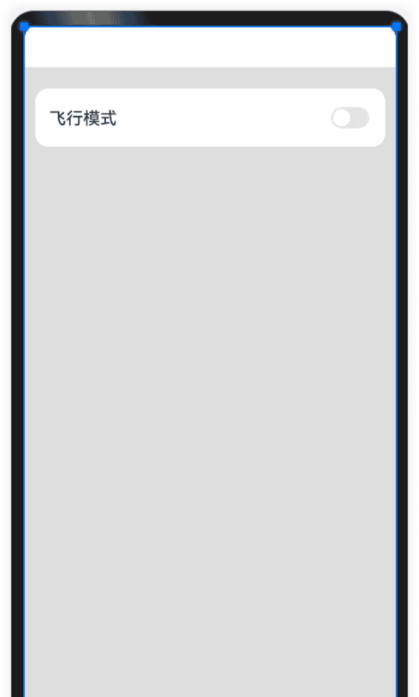
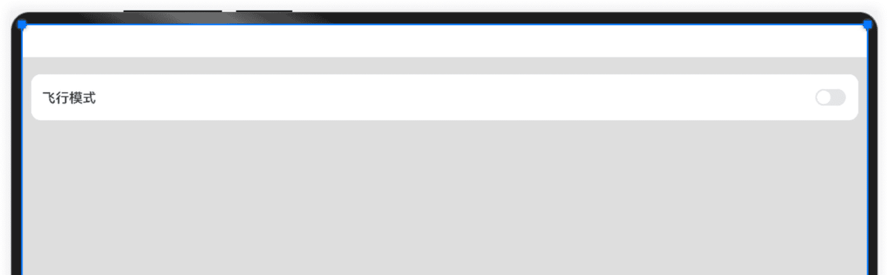
3.1 拉伸能力

//Blank()填充空白区域,达到拉伸效果 Row() { Text('飞行模式') .fontSize(16) .width(135) .height(22) .fontWeight(FontWeight.Medium) .lineHeight(22) Blank() // 通过Blank组件实现拉伸能力 Toggle({ type: ToggleType.Switch }) .width(36) .height(20) } .width("100%") .height(55) .borderRadius(12) .padding({ left: 13, right: 13 }) .backgroundColor('#FFFFFF')bash123456789101112131415161718
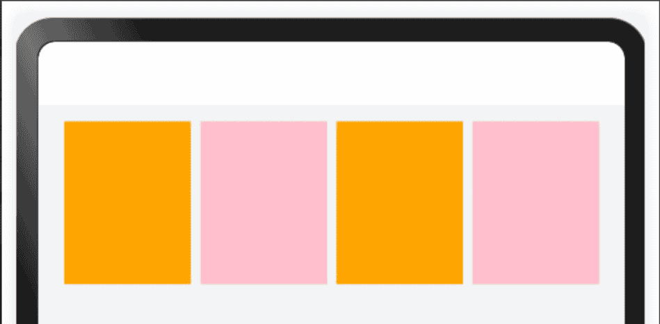
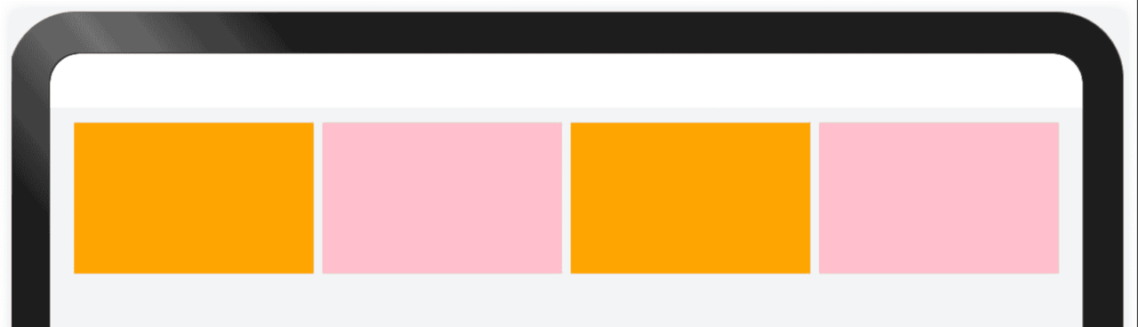
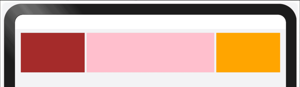
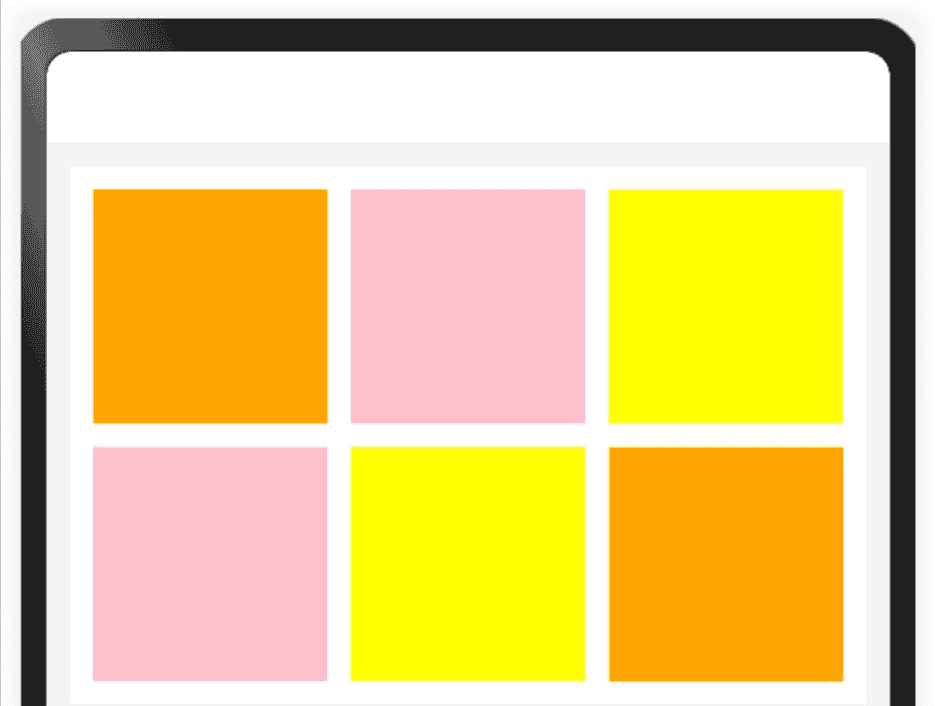
3.2 均分能力
均分能力是指容器组件尺寸发生变化时,增加或减小的空间均匀分配给容器组件内所有空白区域
● .flexShrink(1) 配置了此属性的子组件,按照比例收缩,分配父容器的不足空间。
● .flexGrow(1)配置了此属性的子组件,按照比例拉伸,分配父容器的多余空间。
//均匀分配父容器主轴方向的剩余空间
Row(){
  ForEach([1,2,3,4],(item:number,index:number)=>{
    Row().width(100).height(100).backgroundColor(index%2===0?Color.Orange:Color.Pink)
      .flexShrink(1) //配置了此属性的子组件,按照比例收缩,分配父容器的不足空间。
      .flexGrow(1)	//配置了此属性的子组件,按照比例拉伸,分配父容器的多余空间。
  })
}.width("100%").justifyContent(FlexAlign.SpaceEvenly)

bash
12345678
3.3 占比能力
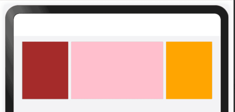
占比能力是指子组件的宽高按照预设的比例,随父容器组件发生变化。占比能力通常有两种实现方式:
● 将子组件的宽高设置为父组件宽高的百分比
● 通过layoutWeight属性配置互为兄弟关系的组件在父容器主轴方向的布局权重
//子组件的宽度,按照比例占满父组件剩余空间; Row({ space: 10 }) { Row().width(100).height(100).backgroundColor(Color.Brown) .layoutWeight(1) Row().width(100).height(100).backgroundColor(Color.Pink) .layoutWeight(2) Row().width(100).height(100).backgroundColor(Color.Orange) .layoutWeight(1) }.width("100%").justifyContent(FlexAlign.SpaceEvenly)bash
3.4 缩放能力
缩放能力是指子组件的宽高按照预设的比例,随容器组件发生变化,且变化过程中子组件的宽高比不变。
● 使用百分比布局配合固定宽高比(aspectRatio属性)实现当容器尺寸发生变化时,内容自适应调整。
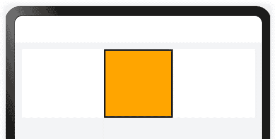
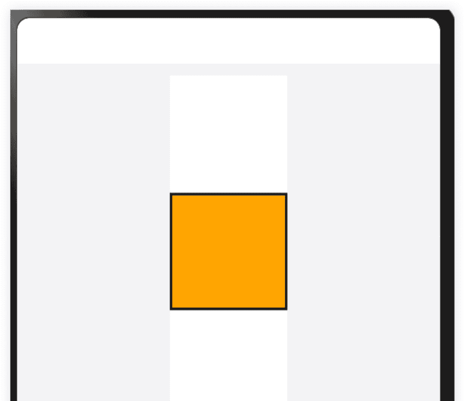
Row() { Column() { Column() { Row().width("100%").height("100%").backgroundColor(Color.Orange) }.aspectRatio(1) //固定宽高比为1,即:width/height = 1 .border({ width: 2, color: Color.Black }) } .width("100%") .height(100) .backgroundColor(Color.White) .justifyContent(FlexAlign.Center) } .width("100%") .justifyContent(FlexAlign.SpaceEvenly)bash
3.5 延伸能力
延伸能力是指容器组件内的子组件,按照其在列表中的先后顺序,随容器组件尺寸变化显示或隐藏。它可以根据显示区域的尺寸,显示不同数量的元素。
延伸能力通常有两种实现方式:
● 通过List组件实现。
● 通过Scroll组件配合Row组件或Column组件实现。
List、Row或Column组件中子节点的在页面显示时就已经全部完成了布局计算及渲染,只不过受限于父容器尺寸,用户只能看到一部分。随着父容器尺寸增大,用户可以看到的子节点数目也相应的增加。用户还可以通过手指滑动触发列表滑动,查看被隐藏的子节点。
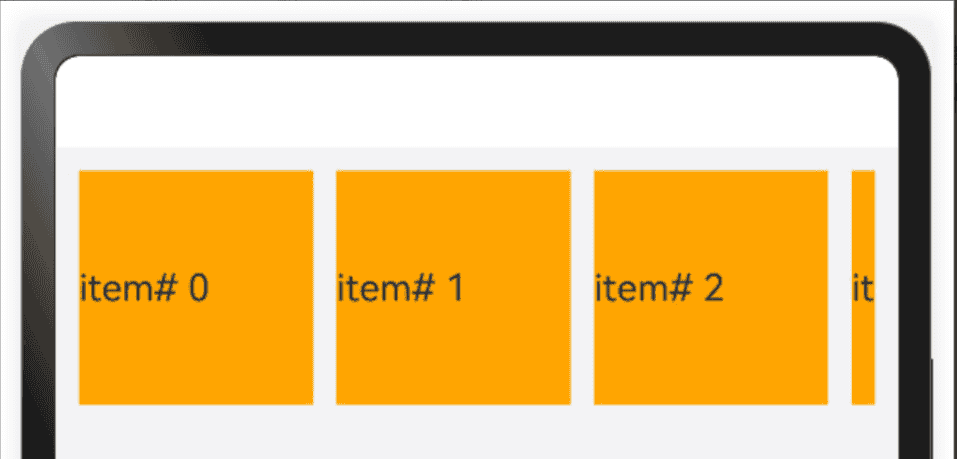
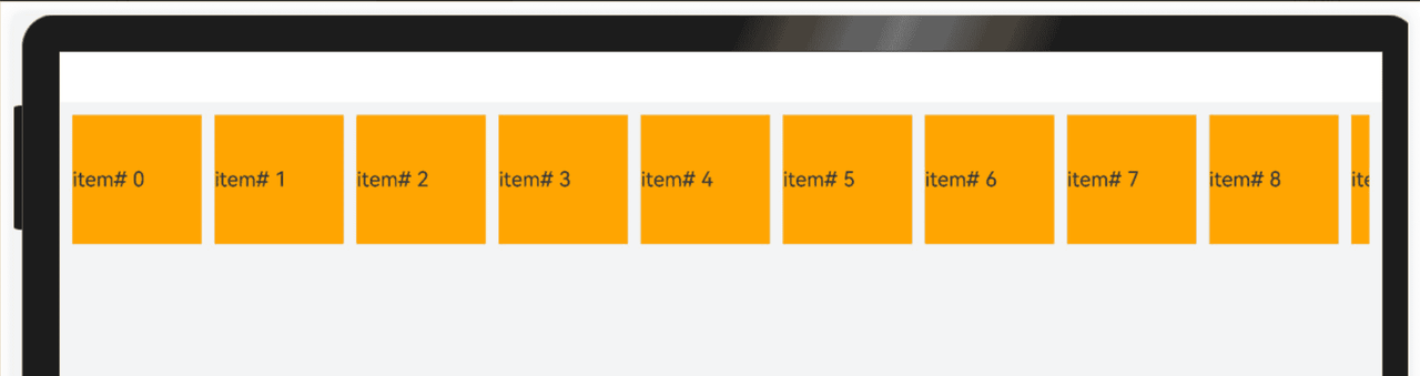
List({space:10}){
  ForEach(Array.of(1,2,3,4,5,6,7,8,9,10),(item:number,index:number)=>{
    ListItem(){
      Text(`item# ${index}`).width(100).height(100).backgroundColor(Color.Orange)
    }
  })
}.listDirection(Axis.Horizontal)
.width("100%")
.height("100%")

bash
123456789
3.6 隐藏能力
隐藏能力是指容器组件内的子组件,按照其预设的显示优先级,随容器组件尺寸变化显示或隐藏,其中相同显示优先级的子组件同时显示或隐藏。
● 隐藏能力通过设置布局优先级(displayPriority属性)来控制显隐,当布局主轴方向剩余尺寸不足以满足全部元素时,按照布局优先级大小,从小到大依次隐藏,直到容器能够完整显示剩余元素。具有相同布局优先级的元素将同时显示或者隐藏。
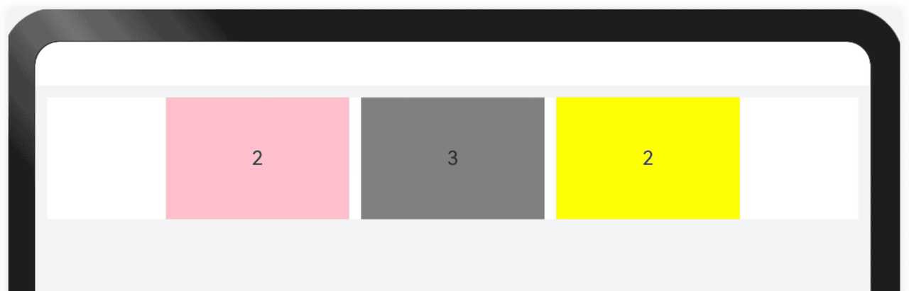
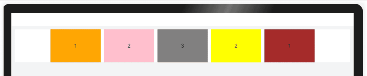
Row({space:10}){ Text("1").width(150).height(100).backgroundColor(Color.Orange).textAlign(TextAlign.Center) .displayPriority(1) Text("2").width(150).height(100).backgroundColor(Color.Pink).textAlign(TextAlign.Center) .displayPriority(2) Text("3").width(150).height(100).backgroundColor(Color.Gray).textAlign(TextAlign.Center) .displayPriority(3) Text("2").width(150).height(100).backgroundColor(Color.Yellow).textAlign(TextAlign.Center) .displayPriority(2) Text("1").width(150).height(100).backgroundColor(Color.Brown).textAlign(TextAlign.Center) .displayPriority(1) } .width("100%") .height(100) .backgroundColor(Color.White) .justifyContent(FlexAlign.Center)bash
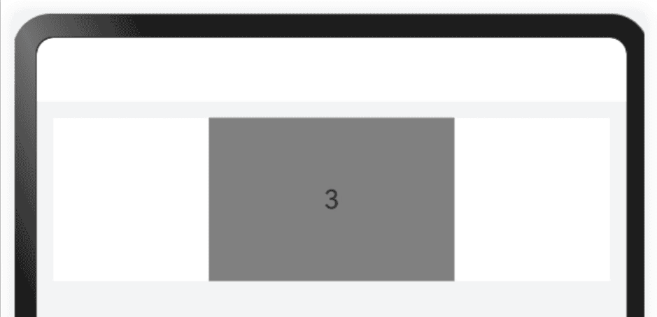
3.7 折行能力
折行能力是指容器组件尺寸发生变化,当布局方向尺寸不足以显示完整内容时自动换行。它常用于横竖屏适配或默认设备向平板切换的场景。
● 折行能力通过使用 Flex折行布局 (将wrap属性设置为FlexWrap.Wrap)实现,当横向布局尺寸不足以完整显示内容元素时,通过折行的方式,将元素显示在下方。
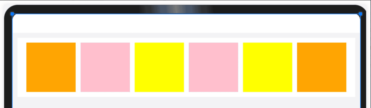
Flex({ direction: FlexDirection.Row, alignItems: ItemAlign.Center, justifyContent: FlexAlign.Center, wrap: FlexWrap.Wrap, space:{ cross:LengthMetrics.vp(10), main:LengthMetrics.vp(10) } }){ Row().width(100).height(100).backgroundColor(Color.Orange) Row().width(100).height(100).backgroundColor(Color.Pink) Row().width(100).height(100).backgroundColor(Color.Yellow) Row().width(100).height(100).backgroundColor(Color.Pink) Row().width(100).height(100).backgroundColor(Color.Yellow) Row().width(100).height(100).backgroundColor(Color.Orange) } .width("100%") .backgroundColor(Color.White) .padding(10)bash
4. 响应式布局
‼️ 自适应布局的局限性
自适应布局可以保证窗口尺寸在一定范围内变化时,页面的显示是正常的。但是将窗口尺寸变化较大时(如窗口宽度从400vp变化为1000vp),仅仅依靠自适应布局可能出现图片异常放大或页面内容稀疏、留白过多等问题。
小屏幕的拉伸(留白适中)
大屏幕的拉伸(留白合理)
🔔 响应式布局简介
由于自适应布局能力有限,无法适应较大的页面尺寸调整,此时就需要借助响应式布局能力调整页面结构。响应式布局中最常使用的特征是,可以将窗口宽度划分为不同的断点,当窗口宽度从一个断点变化到另一个断点时,改变页面布局以获得更好的显示效果。
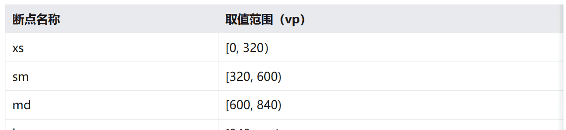
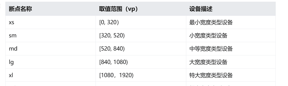
4.1 断点
断点是将应用窗口在宽度维度上分成了几个不同的区间(即不同的断点),在不同的区间下,开发者可根据需要实现不同的页面布局效果。具体的断点如下所示。
说明
● 开发者可以根据实际使用场景决定适配哪些断点。如xs断点对应的一般是智能穿戴类设备,如果确定某页面不会在智能穿戴设备上显示,则可以不适配xs断点。
● 可以根据实际需要在lg断点后面新增xl、xxl等断点,但注意新增断点会同时增加UX设计师及应用开发者的工作量,除非必要否则不建议盲目新增断点。
4.2 监听断点变化方式
理解了断点含义之后,还有一件事情非常重要就是要监听断点的变化,判断应用当前处于何种断点,进而可以调整应用的布局。
常见的监听断点变化的方法如下所示:
● 获取窗口对象并监听窗口尺寸变化
● 通过媒体查询监听应用窗口尺寸变化
● 借助栅格组件能力监听不同断点的变化
4.2.1 窗口对象监听断点变化
在UIAbility的onWindowStageCreate生命周期回调中,通过窗口对象获取启动时的应用窗口宽度并注册回调函数监听窗口尺寸变化。将窗口尺寸的长度单位由px换算为vp后,即可基于前文中介绍的规则得到当前断点值,此时可以使用状态变量记录当前的断点值方便后续使用。
// MainAbility.ts import { window, display } from '@kit.ArkUI'; import { UIAbility } from '@kit.AbilityKit'; export default class MainAbility extends UIAbility { private windowObj?: window.Window; private curBp: string = ''; //... // 根据当前窗口尺寸更新断点 private updateBreakpoint(windowWidth: number) :void{ // 将长度的单位由px换算为vp let windowWidthVp = windowWidth / display.getDefaultDisplaySync().densityPixels; let newBp: string = ''; if (windowWidthVp < 320) { newBp = 'xs'; } else if (windowWidthVp < 600) { newBp = 'sm'; } else if (windowWidthVp < 840) { newBp = 'md'; } else { newBp = 'lg'; } if (this.curBp !== newBp) { this.curBp = newBp; // 使用状态变量记录当前断点值 AppStorage.setOrCreate('currentBreakpoint', this.curBp); } } onWindowStageCreate(windowStage: window.WindowStage) :void{ windowStage.getMainWindow().then((windowObj) => { this.windowObj = windowObj; // 获取应用启动时的窗口尺寸 this.updateBreakpoint(windowObj.getWindowProperties().windowRect.width); // 注册回调函数,监听窗口尺寸变化 windowObj.on('windowSizeChange', (windowSize)=>{ this.updateBreakpoint(windowSize.width); }) }); // ... } //... }bash
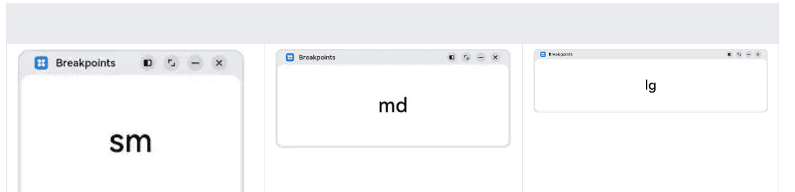
a. 在页面中,获取及使用当前的断点。
@Entry @Component struct Index { @StorageProp('currentBreakpoint') curBp: string = 'sm'; build() { Flex({justifyContent: FlexAlign.Center, alignItems: ItemAlign.Center}) { Text(this.curBp) .fontSize(50) .fontWeight(FontWeight.Medium) } .width('100%') .height('100%') } }bash
b. 运行及验证效果。
4.2.2 媒体查询监听断点变化
媒体查询提供了丰富的媒体特征监听能力,可以监听应用显示区域变化、横竖屏、深浅色、设备类型等等,因此在应用开发过程中使用的非常广泛。
本小节仅介绍媒体查询跟断点的结合,即如何借助媒体查询能力,监听断点的变化。
1.对通过媒体查询监听断点的功能做简单的封装,方便后续使用
// common/breakpointsystem.ets import { mediaquery } from '@kit.ArkUI'; export type BreakpointType = 'xs' | 'sm' | 'md' | 'lg' | 'xl' | 'xxl'; export interface Breakpoint { name: BreakpointType; size: number; mediaQueryListener?: mediaquery.MediaQueryListener; } export class BreakpointSystem { private static instance: BreakpointSystem; private readonly breakpoints: Breakpoint[] = [ { name: 'xs', size: 0 }, { name: 'sm', size: 320 }, { name: 'md', size: 600 }, { name: 'lg', size: 840 } ] private states: Set<BreakpointState<Object>>; private constructor() { this.states = new Set(); } public static getInstance(): BreakpointSystem { if (!BreakpointSystem.instance) { BreakpointSystem.instance = new BreakpointSystem(); } return BreakpointSystem.instance; } public attach(state: BreakpointState<Object>): void { this.states.add(state); } public detach(state: BreakpointState<Object>): void { this.states.delete(state); } public start() { this.breakpoints.forEach((breakpoint: Breakpoint, index) => { let condition: string; if (index === this.breakpoints.length - 1) { condition = `(${breakpoint.size}vp<=width)`; } else { condition = `(${breakpoint.size}vp<=width<${this.breakpoints[index + 1].size}vp)`; } breakpoint.mediaQueryListener = mediaquery.matchMediaSync(condition); if (breakpoint.mediaQueryListener.matches) { this.updateAllState(breakpoint.name); } breakpoint.mediaQueryListener.on('change', (mediaQueryResult) => { if (mediaQueryResult.matches) { this.updateAllState(breakpoint.name); } }) }) } private updateAllState(type: BreakpointType): void { this.states.forEach(state => state.update(type)); } public stop() { this.breakpoints.forEach((breakpoint: Breakpoint, index) => { if (breakpoint.mediaQueryListener) { breakpoint.mediaQueryListener.off('change'); } }) this.states.clear(); } } export interface BreakpointOptions<T> { xs?: T; sm?: T; md?: T; lg?: T; xl?: T; xxl?: T; } export class BreakpointState<T extends Object> { public value: T | undefined = undefined; private options: BreakpointOptions<T>; constructor(options: BreakpointOptions<T>) { this.options = options; } static of<T extends Object>(options: BreakpointOptions<T>): BreakpointState<T> { return new BreakpointState(options); } public update(type: BreakpointType): void { if (type === 'xs') { this.value = this.options.xs; } else if (type === 'sm') { this.value = this.options.sm; } else if (type === 'md') { this.value = this.options.md; } else if (type === 'lg') { this.value = this.options.lg; } else if (type === 'xl') { this.value = this.options.xl; } else if (type === 'xxl') { this.value = this.options.xxl; } else { this.value = undefined; } } }bash
在页面中,通过媒体查询,监听应用窗口宽度变化,获取当前应用所处的断点值。
// MediaQuerySample.ets import { BreakpointSystem, BreakpointState } from '../common/breakpointsystem'; @Entry @Component struct MediaQuerySample { @State compStr: BreakpointState<string> = BreakpointState.of({ sm: "sm", md: "md", lg: "lg" }); @State compImg: BreakpointState<Resource> = BreakpointState.of({ sm: $r('app.media.sm'), md: $r('app.media.md'), lg: $r('app.media.lg') }); aboutToAppear() { BreakpointSystem.getInstance().attach(this.compStr); BreakpointSystem.getInstance().attach(this.compImg); BreakpointSystem.getInstance().start(); } aboutToDisappear() { BreakpointSystem.getInstance().detach(this.compStr); BreakpointSystem.getInstance().detach(this.compImg); BreakpointSystem.getInstance().stop(); } build() { Flex({ direction: FlexDirection.Column, alignItems: ItemAlign.Center, justifyContent: FlexAlign.Center }) { Column() .height(100) .width(100) .backgroundImage(this.compImg.value) .backgroundImagePosition(Alignment.Center) .backgroundImageSize(ImageSize.Contain) Text(this.compStr.value) .fontSize(24) .margin(10) } .width('100%') .height('100%') } }bash
4.3 栅格布局监听断点变化
栅格布局基于屏幕宽度将界面划分为若干等宽列,通过控制元素横跨的列数实现精准布局,并能在不同断点下动态调整元素占比,确保响应式适配。
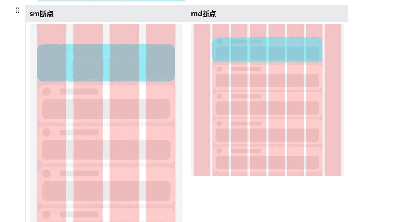
栅格布局默认将屏幕宽度划分为12个等宽列,在不同的断点下,元素所占列数不同,则可以有如下不同的显示效果。
● 在sm断点下,每一个元素占3列,则可形成4个栅格
● 在md断点下:每一个元素占2列,则可形成6个栅格
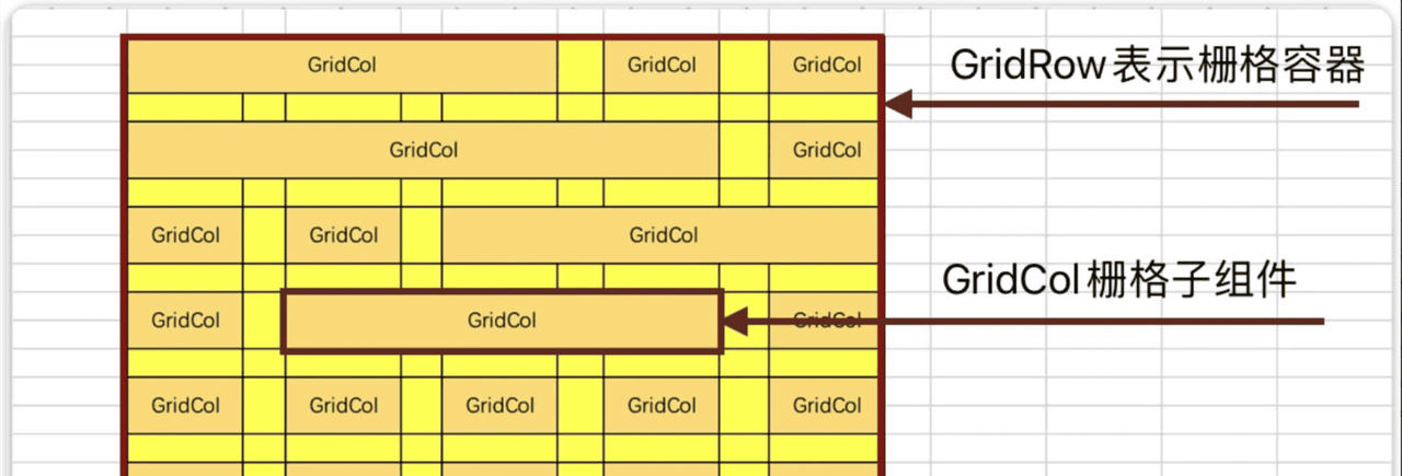
4.3.1 栅格组件介绍
● GridRow: 表示栅格容器组件
● GridCol: 必须使用在GridRow容器内,表示一个栅格子组件
4.3.2 默认栅格列数
栅格系统的总列数可以使用默认值(12列),也可以自己指定列数,还可以根据屏幕的宽度动态调整列数。
默认栅格列数。
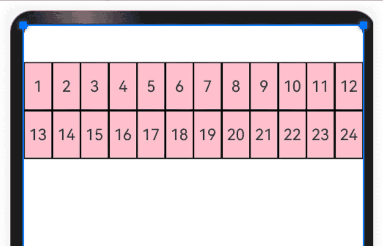
@Entry @Component struct Index { @State items:number[] = [1,2,3,4,5,6,7,8,9,10,11,12,13,14,15,16,17,18,19,20,21,22,23,24] build() { GridRow() { ForEach(this.items,(item:number)=>{ GridCol() { Row() { Text(`${item}`) } .width('100%') .height(50) .border({ width: 1, color: Color.Black, style: BorderStyle.Solid }) .justifyContent(FlexAlign.Center) } }) }.height(300).backgroundColor(Color.Pink) } }bash
4.3.3 指定栅格列数
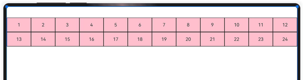
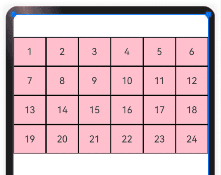
通过GridRow{columns:6}参数可以指定栅格总列数。
● 比如下面案例中,栅格总列数为6,一共24个栅格,那么一行就是6个,一共4行;超过一行的部分自动换行。
@Entry @Component struct Index { @State items: number[] = [1, 2, 3, 4, 5, 6, 7, 8, 9, 10, 11, 12, 13, 14, 15, 16, 17, 18, 19, 20, 21, 22, 23, 24] build() { //指定栅格容器的最大列数 GridRow({ columns: 6 }) { ForEach(this.items, (item: number) => { GridCol() { Row() { Text(`${item}`) } .width('100%') .height(50) .border({ width: 1, color: Color.Black, style: BorderStyle.Solid }) .justifyContent(FlexAlign.Center) } }) }.backgroundColor(Color.Pink) } }bash
4.3.4 动态栅格列数
为了适应不同屏幕尺寸下的布局,栅格系统的总列数可以根据不同的屏幕尺寸动态调整。不同屏幕尺寸的设备,依靠“断点”进行区分,根据断点的不同动态调整栅格列数。
如下代码:根据断点设备设置栅格总列数
import { List } from '@kit.ArkTS' @Entry @Component struct Index { @State items: number[] = [1, 2, 3, 4, 5, 6, 7, 8, 9, 10, 11, 12, 13, 14, 15, 16, 17, 18, 19, 20, 21, 22, 23, 24] build() { GridRow({ //设置屏幕宽度各断点区间值 breakpoints: { value: ['320vp', '520vp', '840vp', '1080vp', '1920vp'] }, //设置对应断点所占列数 columns: { xs: 3, //最小宽度型设备3列 sm: 6, //小宽度设备6列 md: 8, //中型宽度设备8列 lg: 12 //大型宽度设备12列 }, }) { ForEach(this.items, (item: number) => { GridCol() { Row() { Text(`${item}`) } .width('100%') .height(50) .border({ width: 1, color: Color.Black, style: BorderStyle.Solid }) .justifyContent(FlexAlign.Center) } }) }.backgroundColor(Color.Pink) } }bash
4.3.5 设置栅格间距
栅格的样式由Margin、Gutter、Columns三个属性决定。
● Margin是相对应用窗口、父容器的左右边缘的距离,决定了内容可展示的整体宽度。
● Gutter是相邻的两个Column之间的距离,决定内容间的紧密程度。
● Columns是栅格中的列数,其数值决定了内容的布局复杂度。
单个栅格的宽度是系统结合Margin、Gutter和Columns自动计算的,不需要也不允许开发者手动配置。
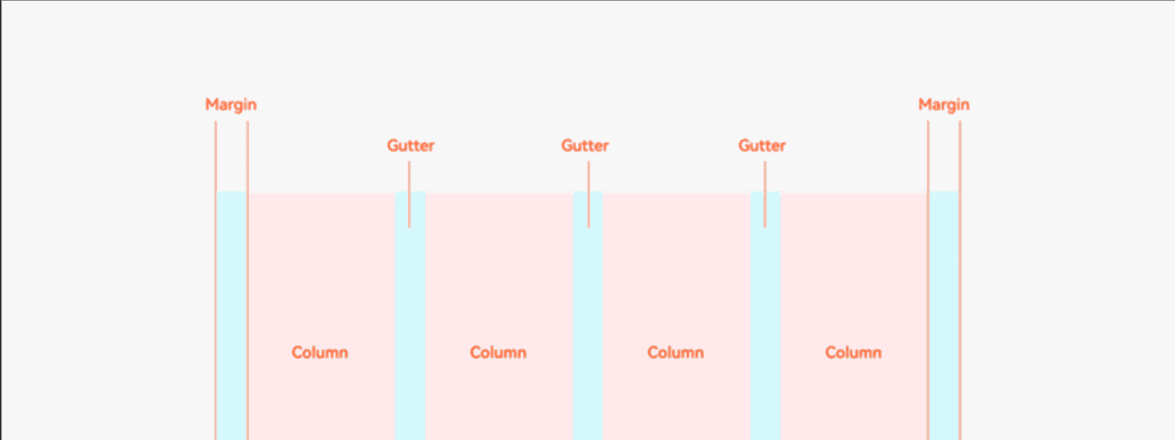
通过GridRow {gutter: 10}参数可以调整栅格子之间的间距,默认为0。
GridRow({
      gutter:10,	//指定栅格间距
      columns:{		//指定栅格列数
        xs:3,
        sm:6,
        md:9,
        lg:12
      }
    })

bash
123456789
4.3.6 设置栅格占用列数
● 通过设置GridCol{span:3}来设置栅格占用的列数,GridRow采用默认列数12列;
○ 在xs断点时:一个栅格元素占12列,一行可容纳1个栅格
○ 在sm断点时,一个栅格元素占6列,一行可容纳2个栅格
○ 在md断点时:一个栅格元素占4列,一行可容纳3个栅格
○ 在lg断点时:一个栅格元素占3列,一行可容纳4个栅格
import { List } from '@kit.ArkTS' @Entry @Component struct Index { @State items: number[] = [1, 2, 3, 4, 5, 6, 7, 8, 9, 10, 11, 12, 13, 14, 15, 16, 17, 18, 19, 20, 21, 22, 23, 24] //当前断点 @State currentBreakPoint: string = "sm" build() { GridRow({ gutter: 10 }) { ForEach(this.items, (item: number, index: number) => { GridCol() { Row() { Text(`${this.currentBreakPoint} #${item}`) } .width('100%') .height(50) .border({ width: 1, color: Color.Black, style: BorderStyle.Solid }) .justifyContent(FlexAlign.Center) }.span({ xs: 12, sm: 6, md: 4, lg: 3 }) }) }.backgroundColor(Color.Pink) .padding(10) //监听断点变化 .onBreakpointChange((breakpoints: string) => { this.currentBreakPoint = breakpoints }) } }bash
© 版权声明
文章版权归作者所有,未经允许请勿转载。
相关文章


暂无评论...